Bridging brands and marketers.
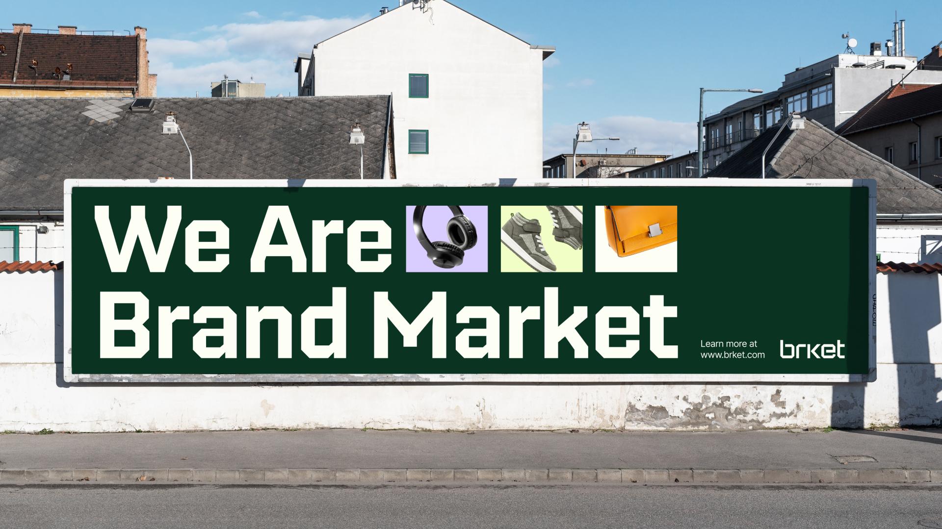
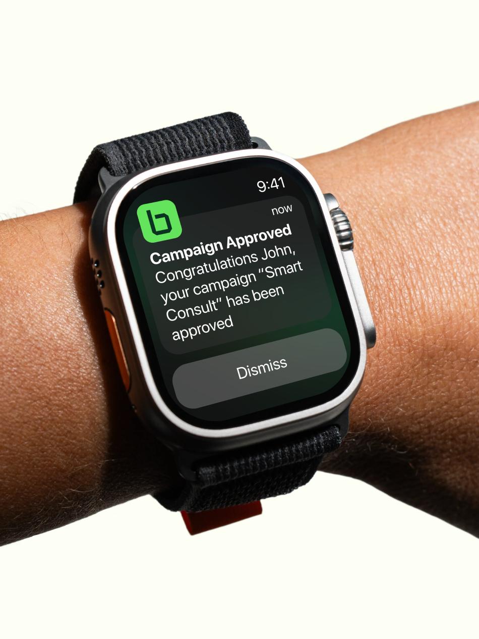
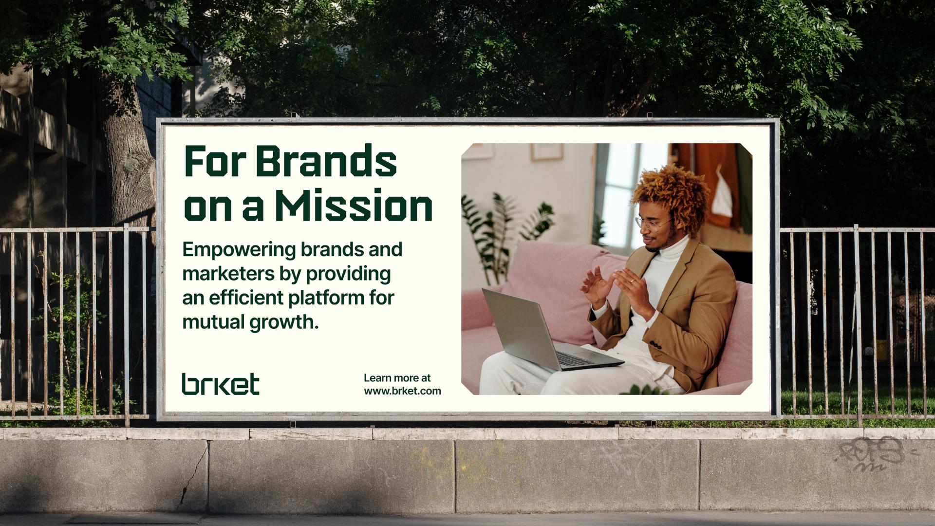
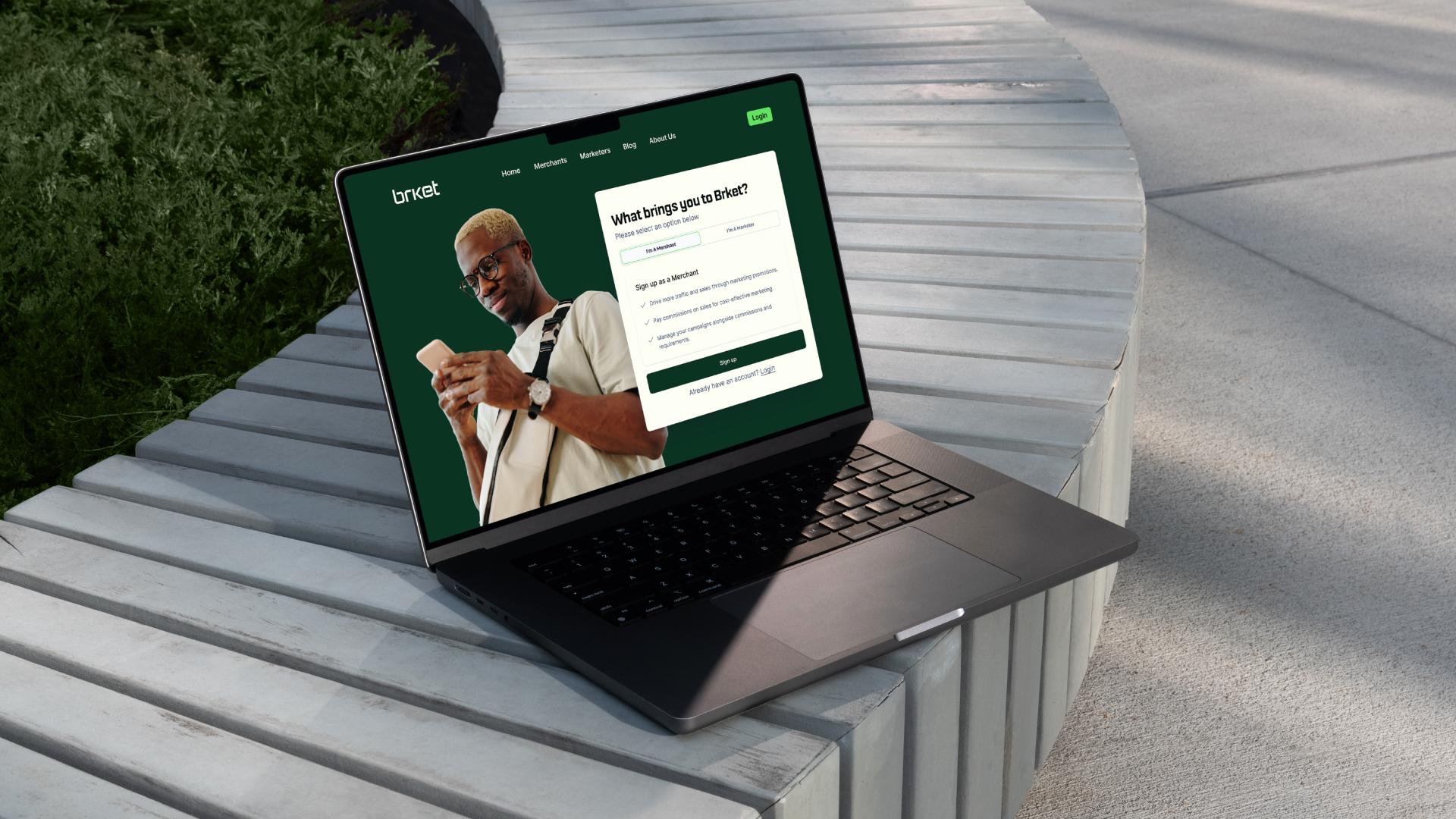
Brket, short for Brand Market, is a platform where brands list products and marketers choose which to promote, earning commissions on terms both sides agree. The identity had to be simple and intuitive, so people can easily understand what the platform offers. It had to signal affordability and value, so clients see it as a smart investment. And because Brket lives online, it had to feel modern and stay recognisable at every format and size.
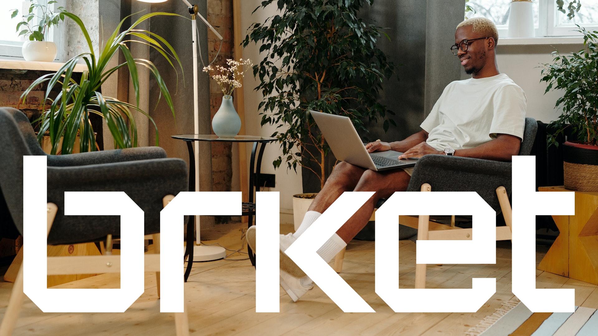
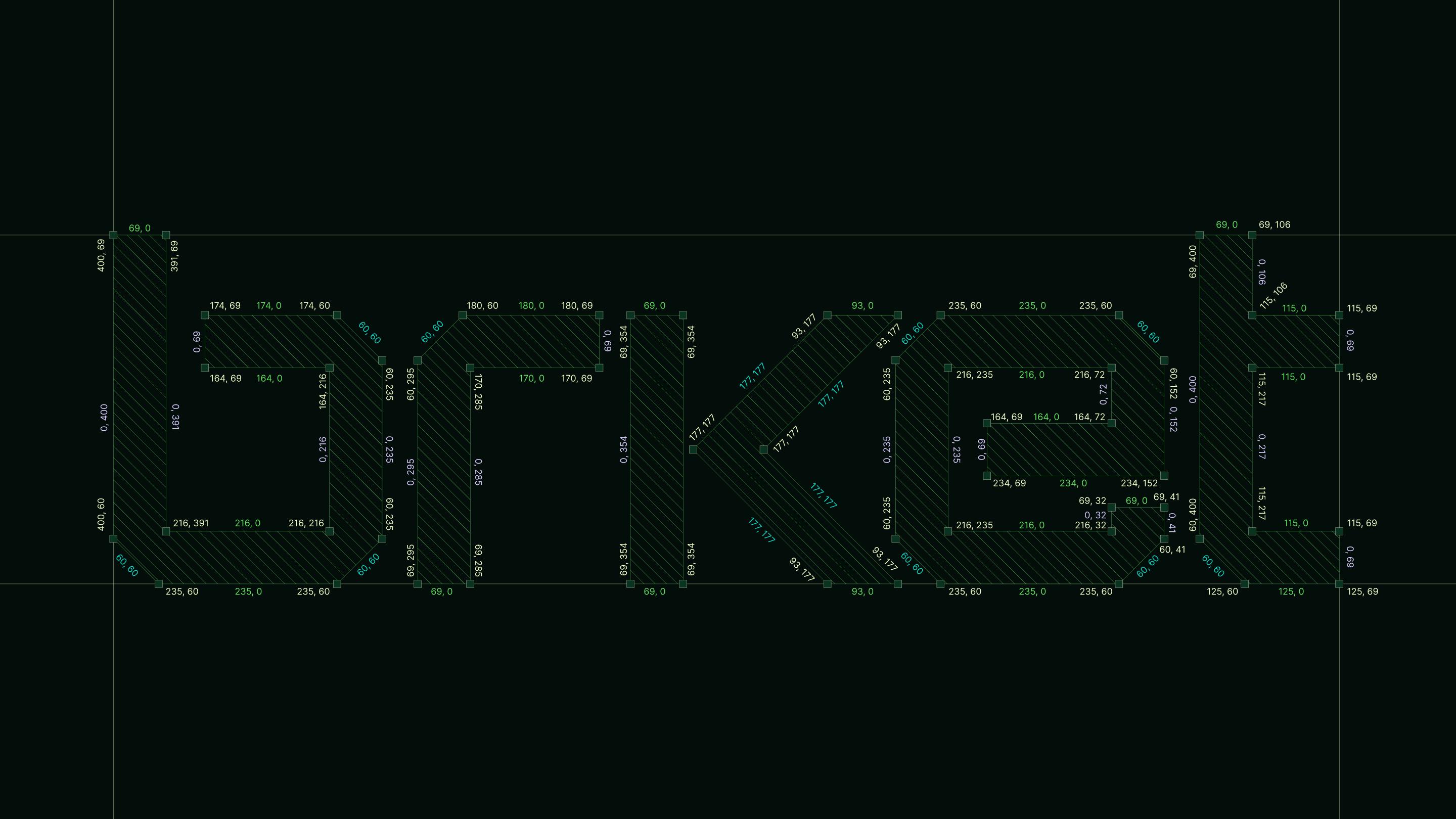
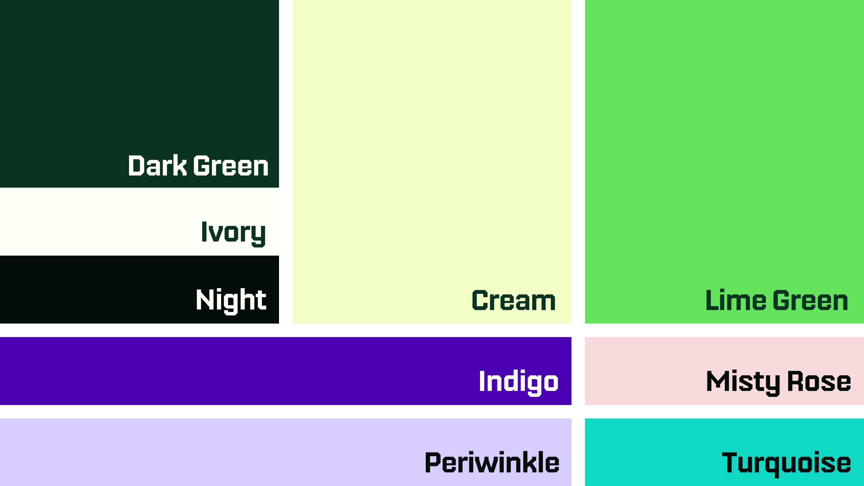
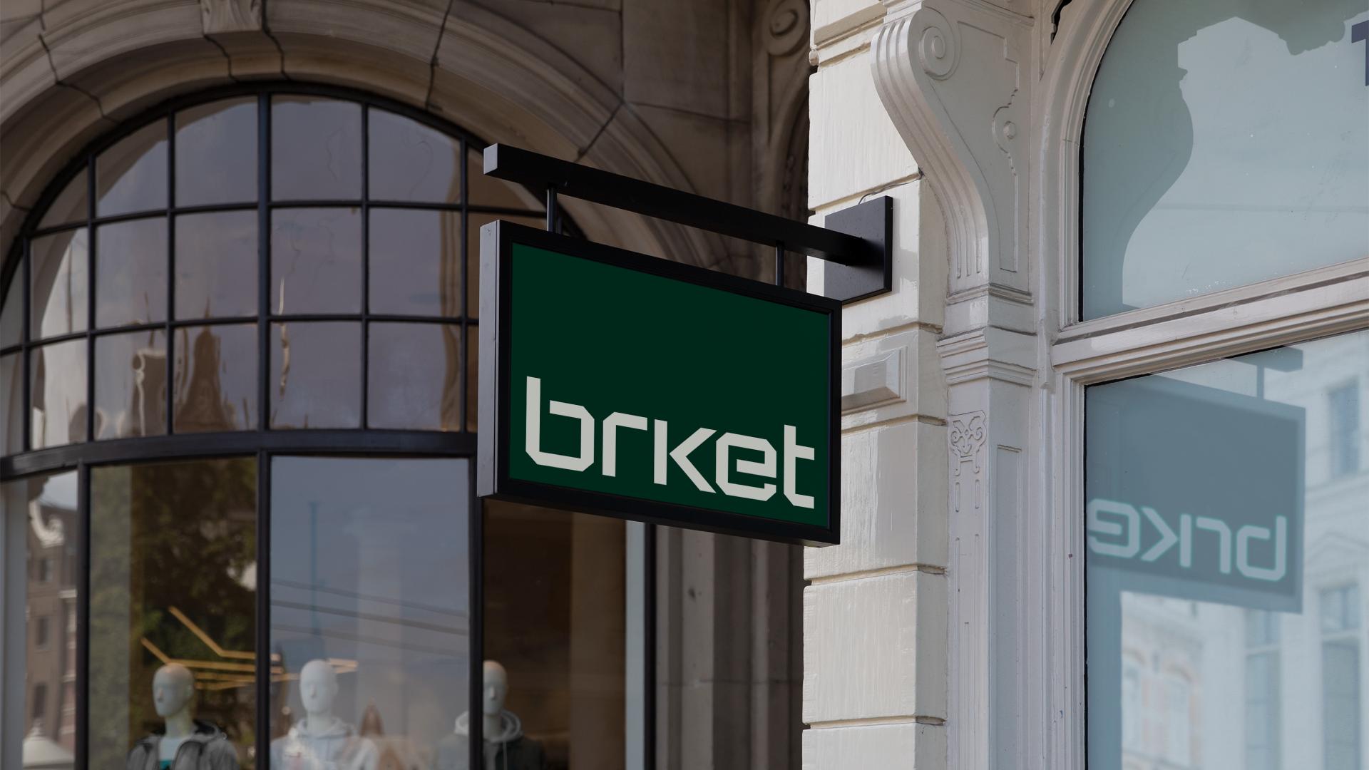
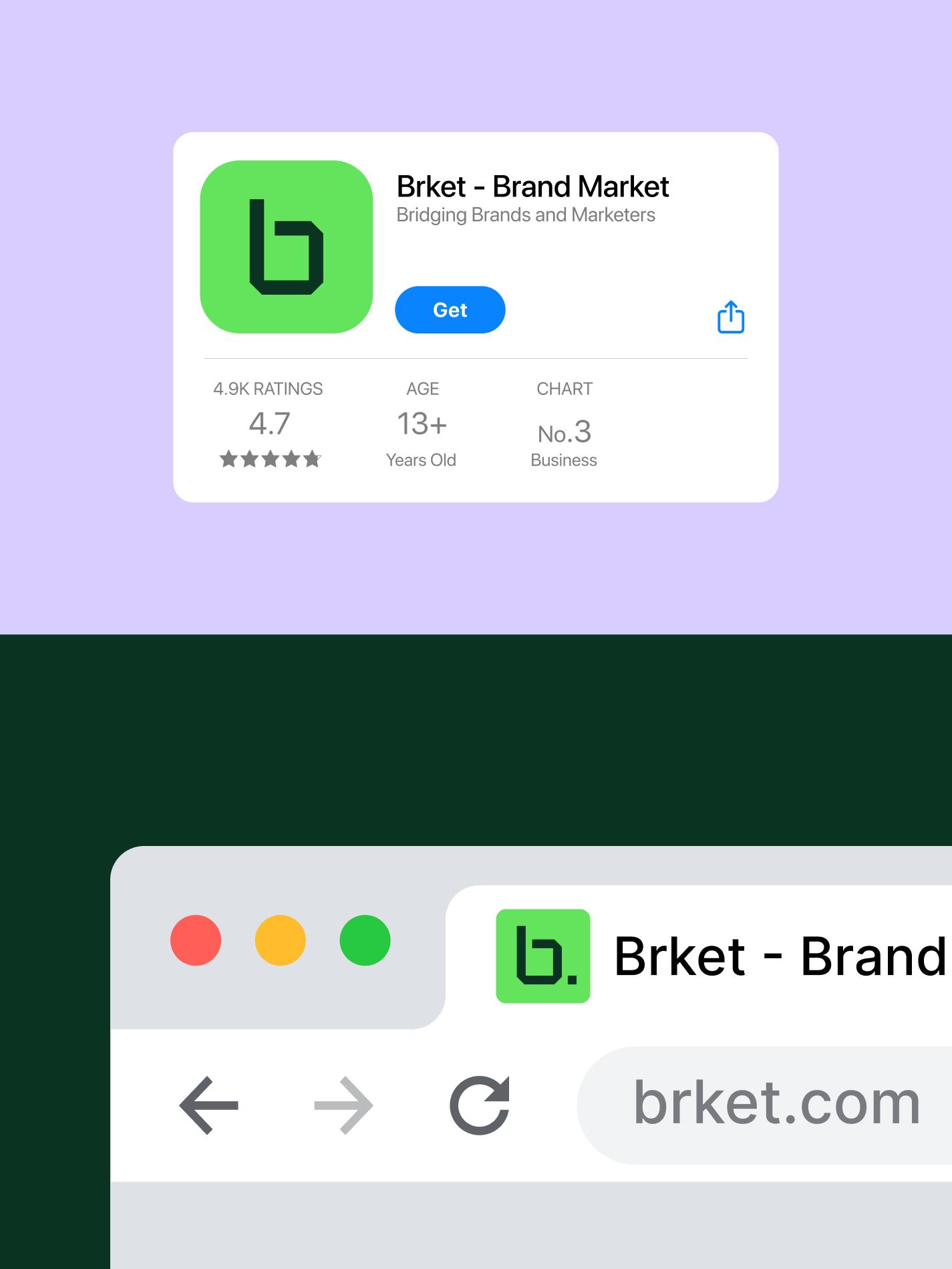
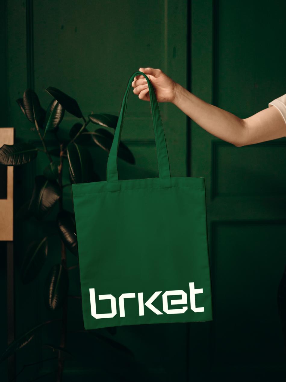
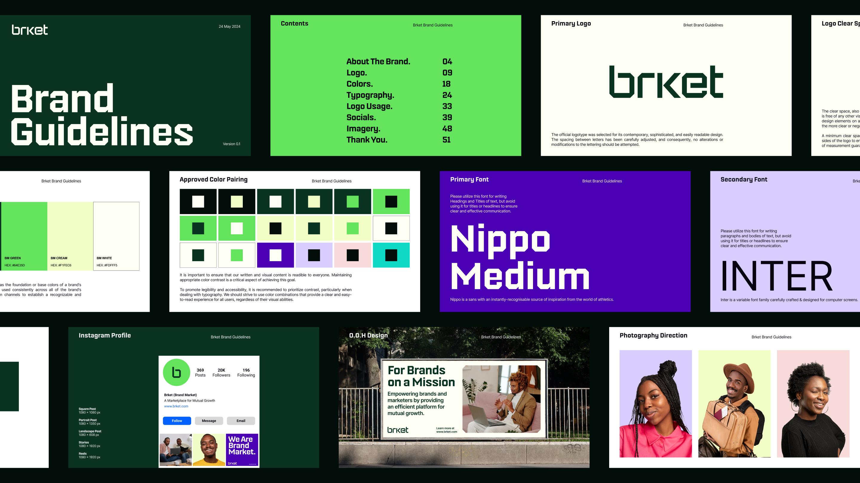
The process began with an analysis of the platform's core values, its audience and its aim of connecting brands and marketers efficiently. The logo is sharp and geometric, with angular lines that read as modern and technical, and it stays clear and recognisable on digital platforms. The palette is Ivory, Dark Green, Lime Green, Cream and Night, chosen for professionalism and trust; the contrast of dark green against ivory adds sophistication. Secondary colours add energy to marketing materials.
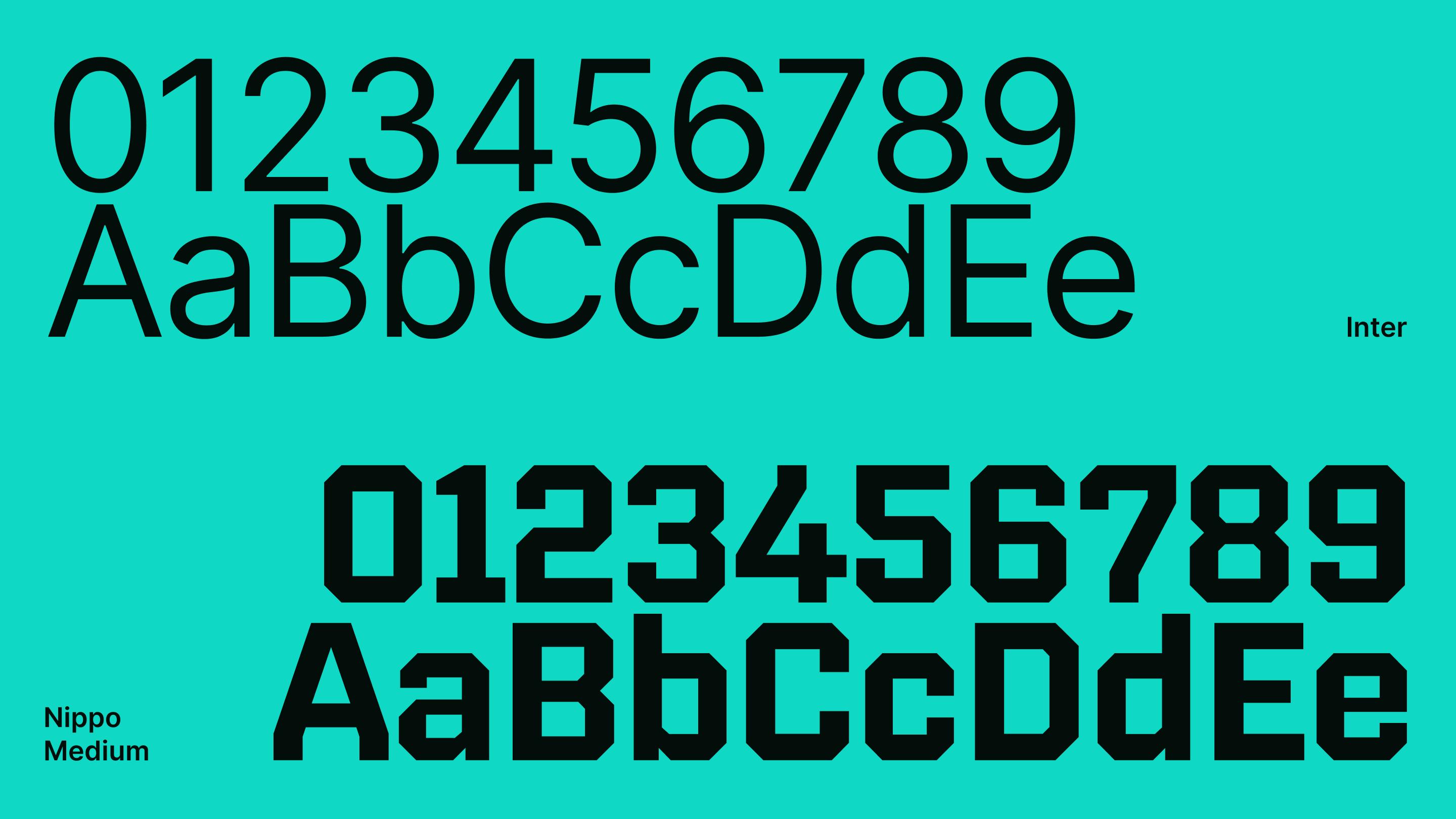
Headlines are set in Nippo, a bold, clear typeface that combines modernity with a slightly technical feel, so they stand out. Body text is set in Inter Regular, chosen for readability and versatility; its clean, neutral design keeps longer passages easy to read. Using the two consistently gives the brand one voice, online and in print.