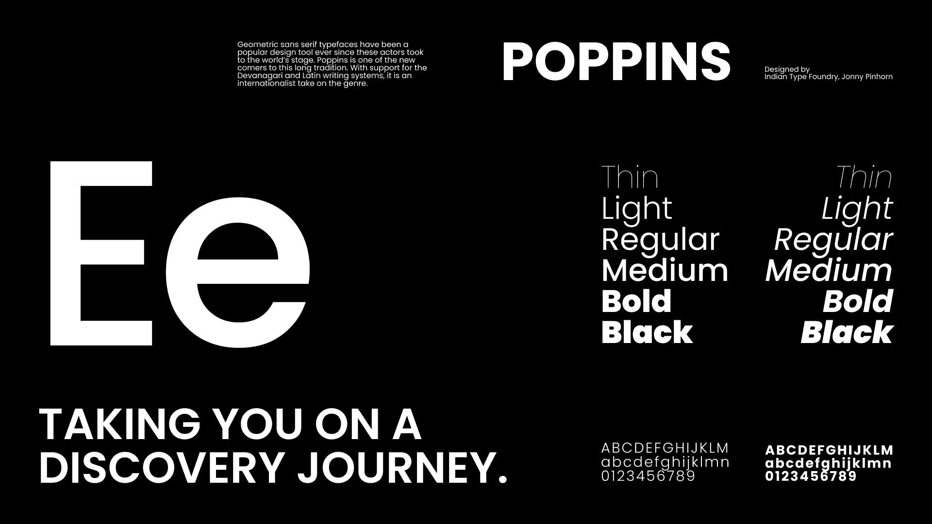
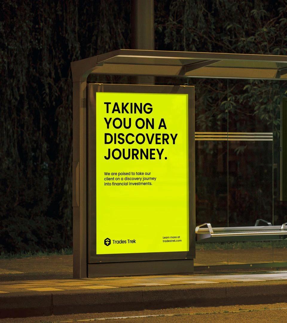
Taking you on a discovery journey.
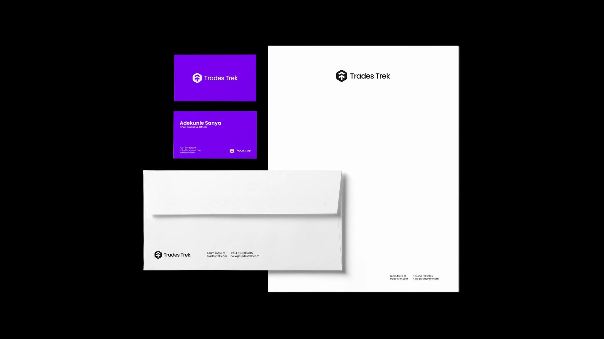
Trades Trek Limited is a financial agency offering investment management, financial training and business advisory. Its clients are mostly stock traders and people interested in financial investment, and the company aims to take them on a discovery journey into investing and trading financial instruments. It wanted an identity its audience would remember. Its aim is to stand out from its competitors and become the major financial market player in Africa.
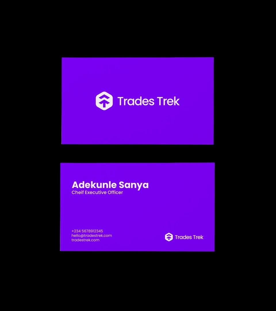
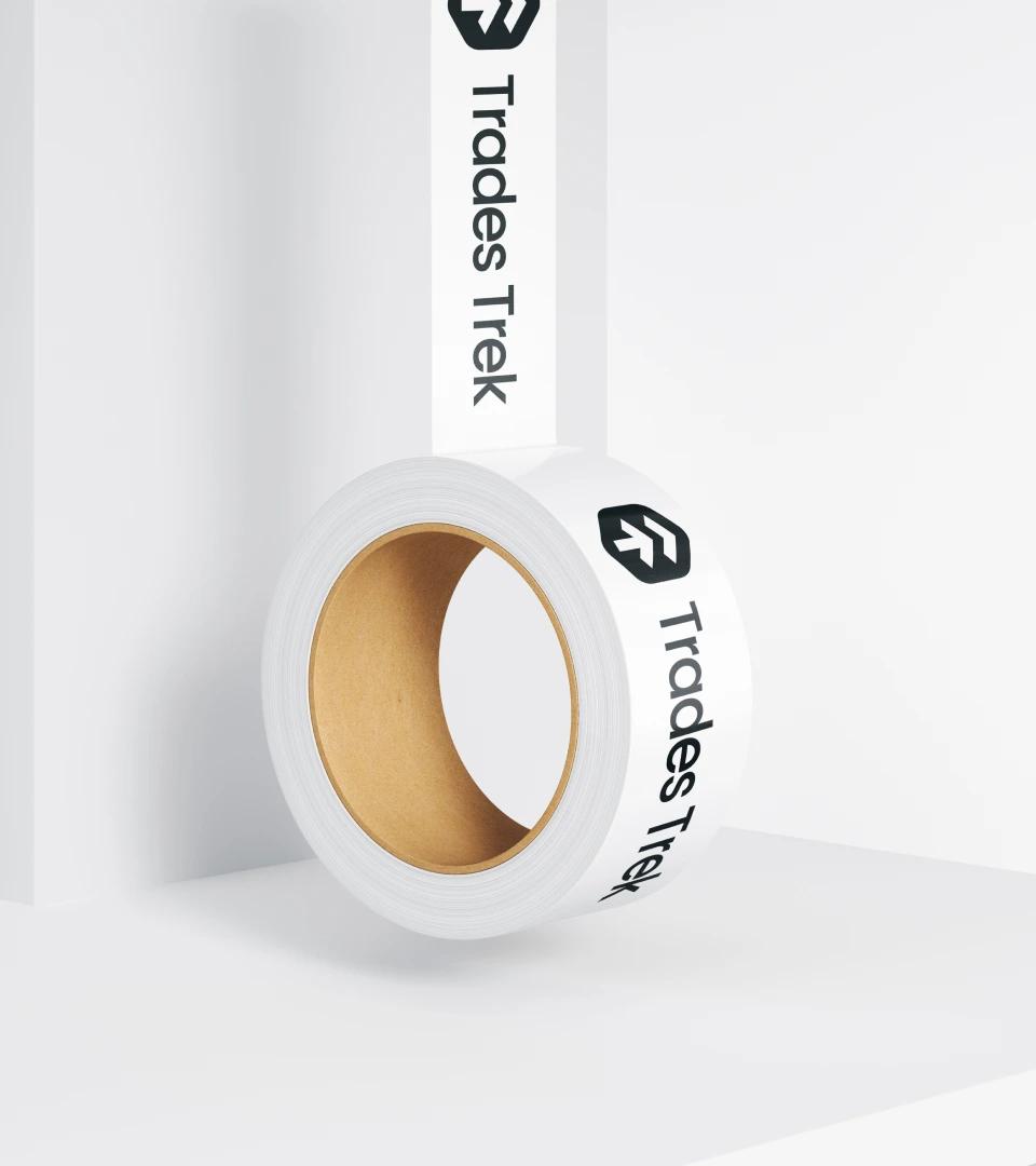
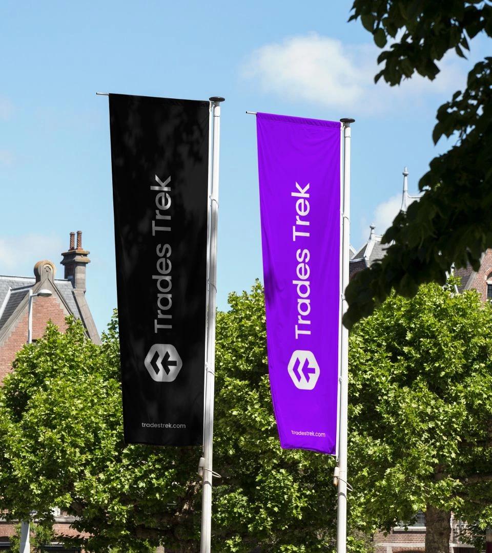
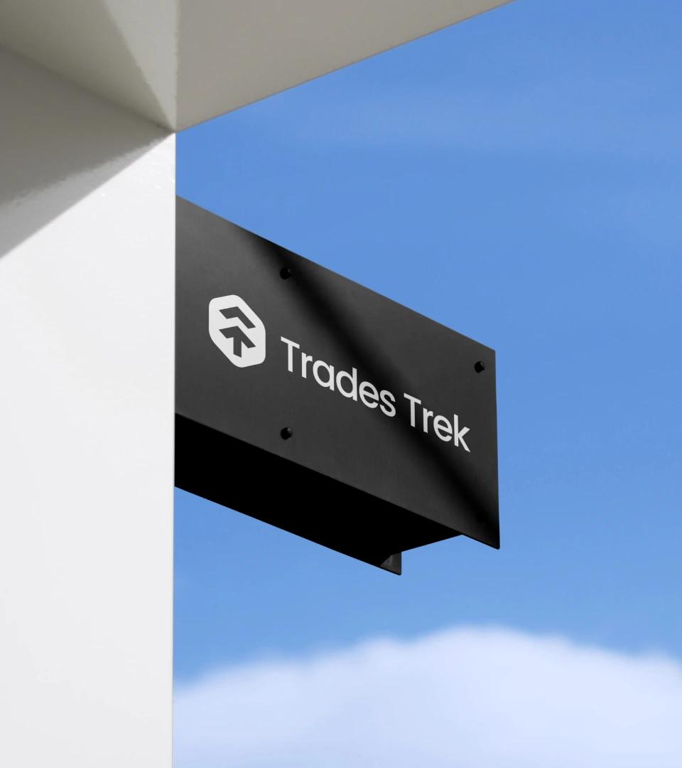
The identity is a modern, dynamic system built around a simple, flexible, future-focused logomark. The aim was to make Trades Trek stand out from its competitors and lift the brand's personality. The mark's abstract shapes are based on two letter Ts, for Trades Trek. It also references an upward arrow, which stands for progress and the company's forward-thinking values.
The primary palette is black, white, violet and lavender blue. The secondary palette adds blue, orange, chartreuse yellow and spring green, for illustrations, marketing materials and secondary uses of the identity. The system is simple, which suits the company's approach to financial technology and business advisory, and is meant to help customers feel confident in its business offer.