Real estate visionaries.
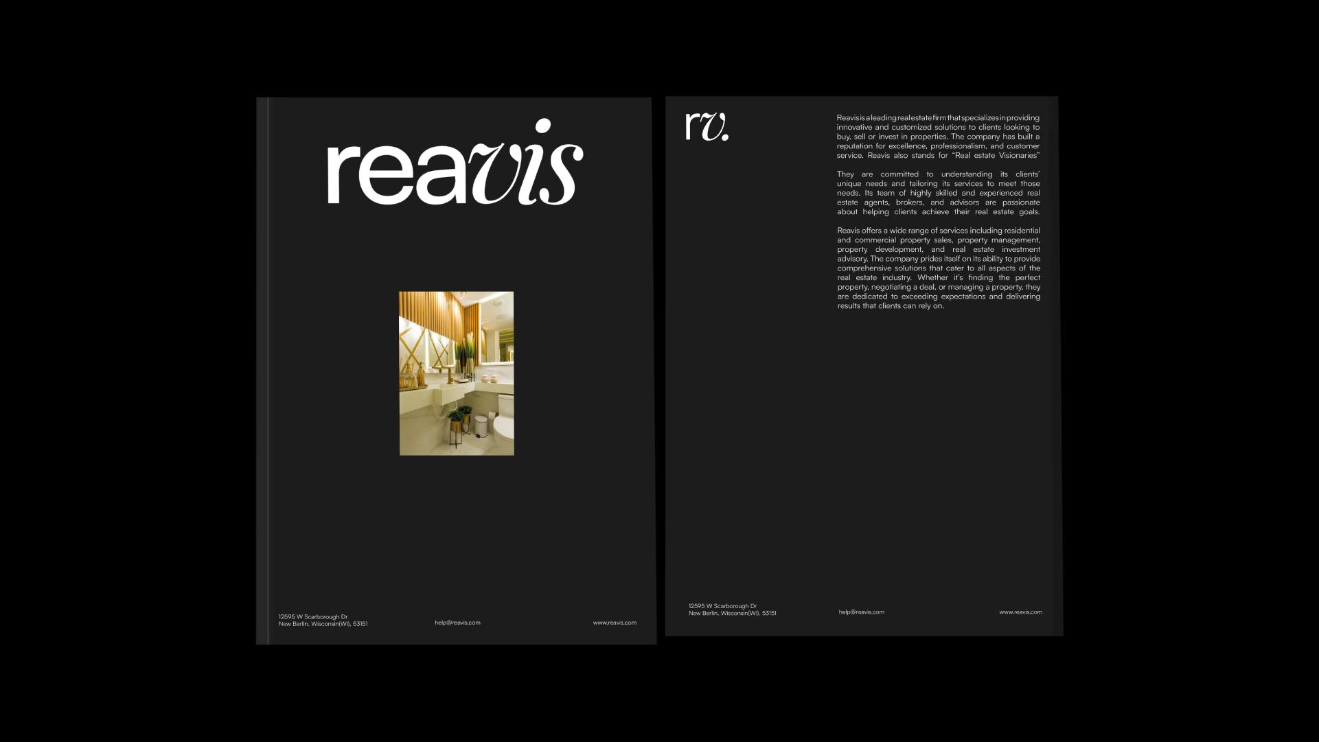
Reavis, short for Real Estate Visionaries, is a real estate firm offering residential and commercial property sales, property management, property development and real estate investment advisory. A team of agents, brokers and advisors tailors each service to the client's needs. The firm describes itself as a leading one, with a reputation for excellence, professionalism and customer service.
The goal was to establish Reavis as a leading global real estate brokerage with its own culture and approach.
The identity needed to represent the firm's values and energy, so the design is modern, simple and future-focused. Its distinct visual language is meant to make the value Reavis offers easy to see and to set the firm apart in a crowded market. Every part of the work, from research to ideation to execution, was aligned with the firm's goals.
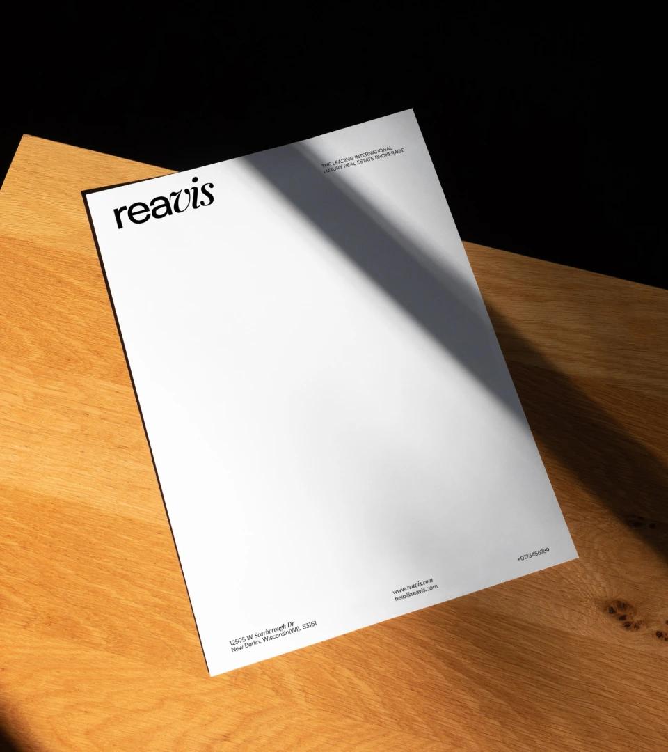
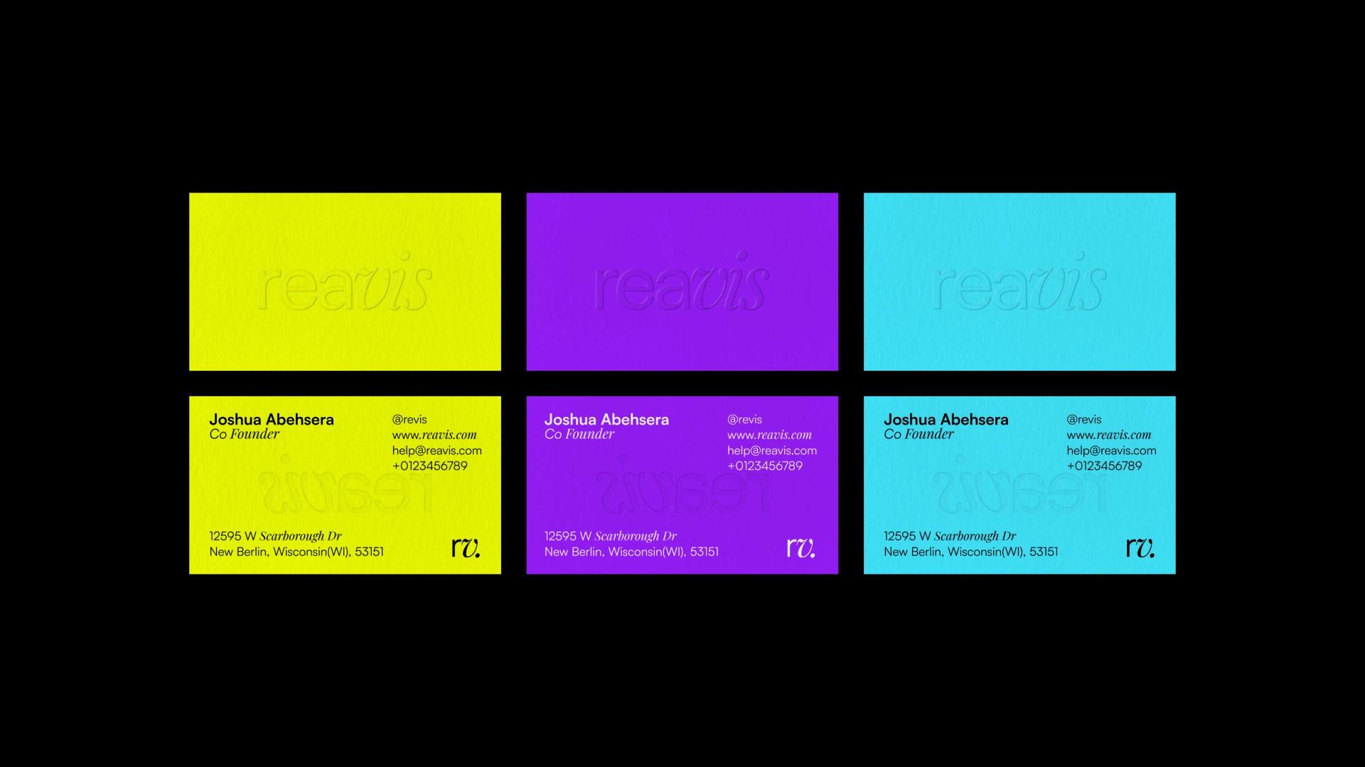
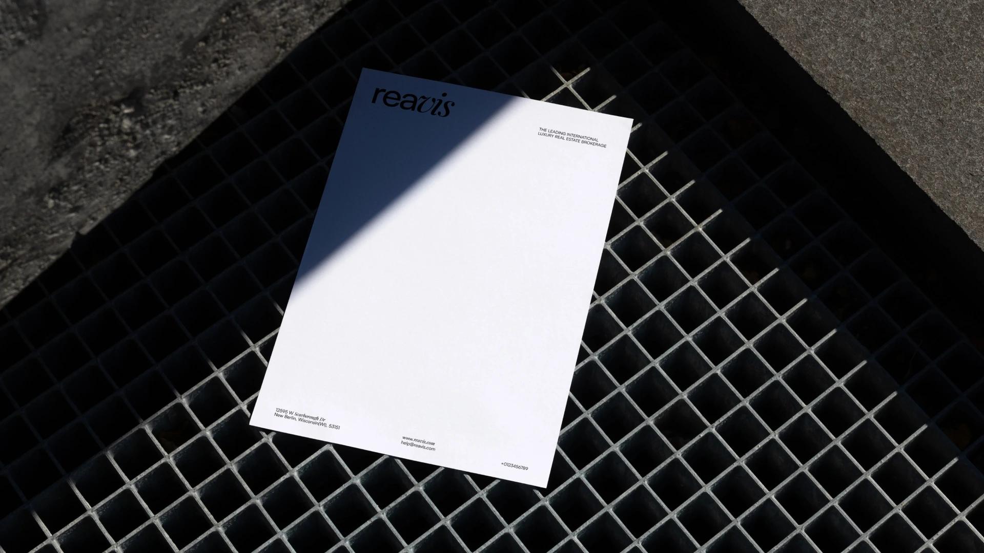
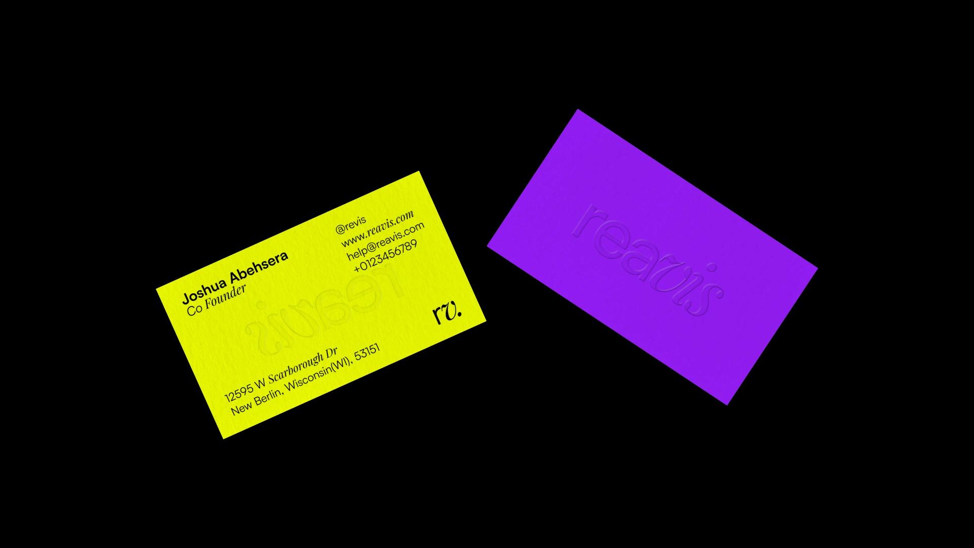
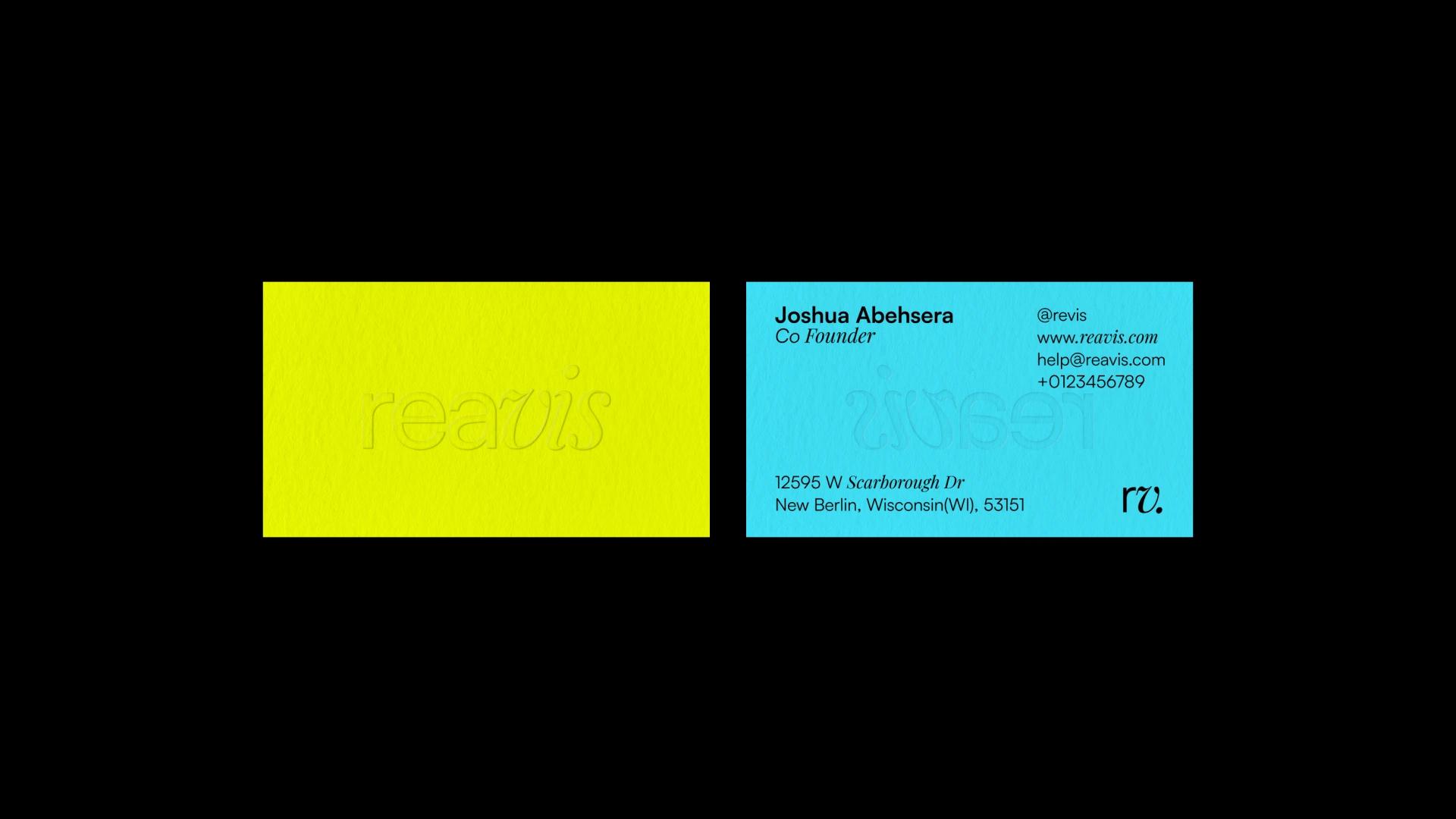
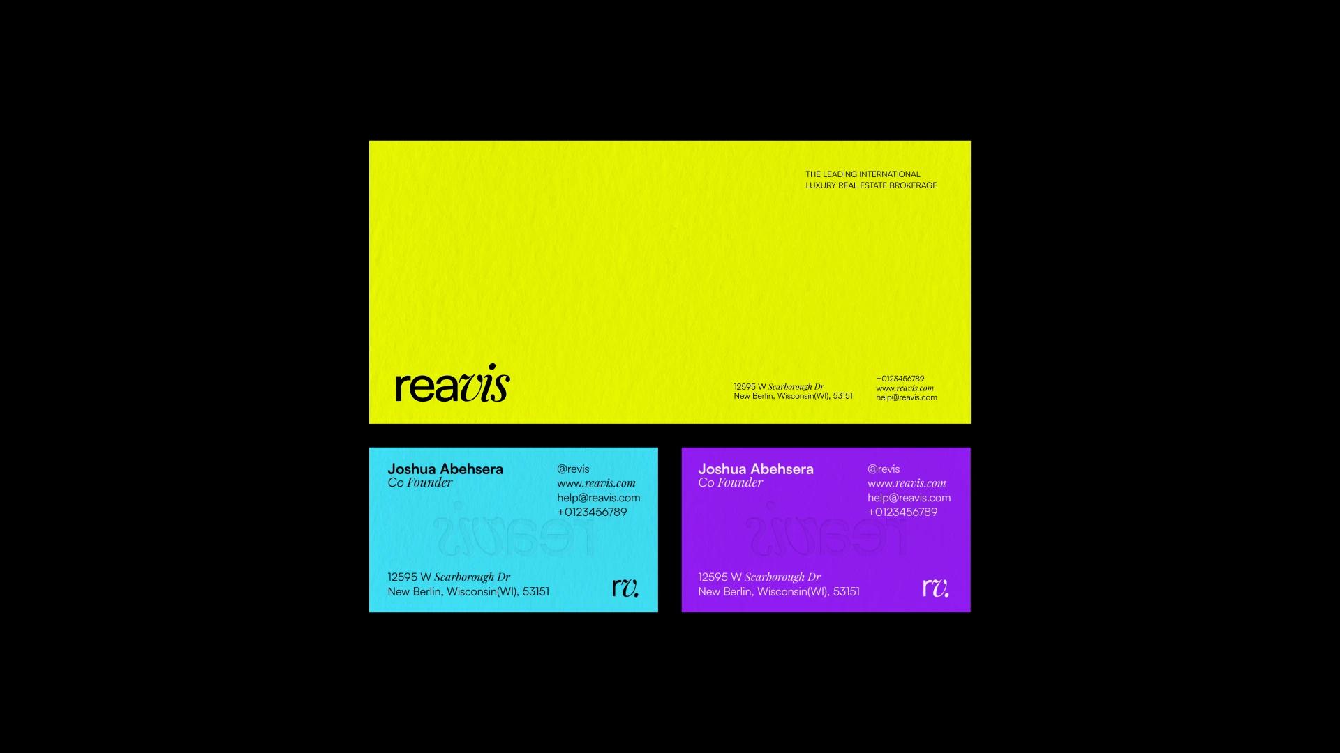
The identity is minimal and sophisticated across its touchpoints. Type pairs Satoshi, a modernist sans-serif with clean, geometric lines, with Playfair Display in italic, an elegant serif that signals quality service and attention to detail. Black and yellow are the primary colours, standing for stability and professionalism, and for optimism and energy. Vivid violet and sky blue are secondary colours for illustrations and marketing materials.